Tallent Sky — UX Case Study

This time i’m going to share my design process of designing Tallent Sky App. This project given a Virtual Internship at Skilvul. The design process is carried out according to the direction given by the mentor from day to day according to the timeline.
Timeline : Approx. 2 Month
Tools : Figma
ABOUT
Tallent Sky is an edutech company that provides various online courses to prepare digital talents in Indonesia by providing courses in programming, digital marketing, UI/UX design, product management, etc.
PROBLEM
Tallent Sky has experienced a decrease in revenue since 1 year ago and the research team has conducted a small research with the following:
- Users aren’t satisfied with the UI
- The platform is complicated for user
- Very long loading time
- It’s hard to find motivation to learn
WORK ON TEAM
In this project, I actually work with 2 friends, Anisa Budi Setiawati and Yuhono Indra Pitarto. in this team my responsibilities are:
- Brainstorm Ideas
- UI Design
- Prototyping
- UX Researcher
OVERVIEW
In terms of designing a product, there are several stages that need to be done. In this case study, the steps taken follow the basic stages in the design thinking process.

I use the design thinking process because Design Thinking is very useful in solving very complex or unknown problems, by rearranging the problem from a human point of view, creating lots of ideas in brainstorming sessions, and adopting a hands-on approach to initial design creation and testing.
A — Empathize
At this stage, the process carried out is to analyze the views and needs of the target user by doing research first before defining the problem and doing ideation. before doing research we determine the target user as bellows:
- Age : 18–55 years
- Profession : Employee and undergrad student
- Language : Indonesian
- Economic level : Middle and above
we started by looking at a few competitors or similar platforms, analyzing UI, UX, User flow, IA and key features.

After doing research on a few competitors, I also did research with an in-depth interview method with one of the users based on predetermined user criteria. The interview was conducted through the Google Meet platform. Before conducting user interviews, I have to determine the data I want to collect, as follows:
- Demographic (like age, address, education, and interests & hobbies)
- Profession (like job, place of work, and position level)
- Pain points or frustrations when using the application online learning
- Pain points or frustrations when studying
- study habits
- learning motivation
Then, I can create questions for user interviews.
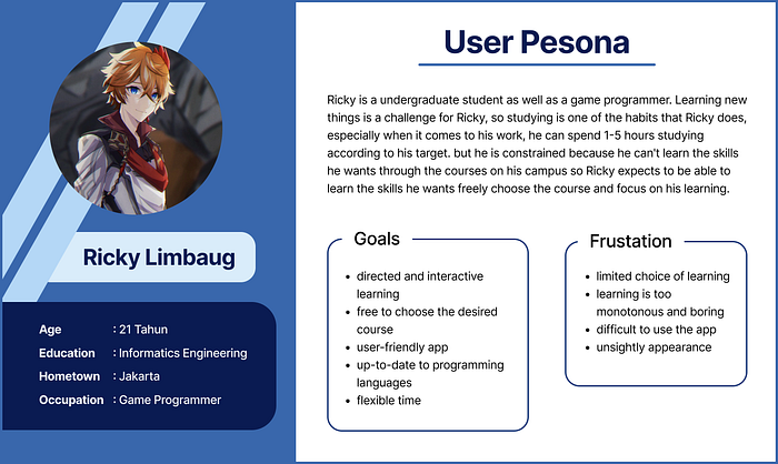
Then after conducting the interview, as part of processing the research findings, I analyze the information that was found on the research phase by creating a User Persona. This persona will contain the details of user’s goals, frustrations, and also other information that might be useful in the design process.

B — Define
After collecting and analyzing all the information obtained from the empathize stage, the next step is to determine user problems which will then be resolved in the design of this product. The define stage we collect the user’s perceived pain points.

Pain points that often arise when using online learning applications are the difficulty of interacting with mentors, limited payment methods, low learning motivation, and other related learning processes.
C — Ideate
After analyzing the problems and opportunities, we formulate the best solution to solve the problems that have been collected in the Define stage.
- Solution
At this stage, we use the HMW (How Might We) method to describe the solution to the problem.
“How might we Creating a simple platform that is interactive and user friendly”
we used the How Might We format because it suggests that a solution is possible and because they offer me the chance to answer them in a variety of ways. A properly framed How Might We don’t suggest a particular solution, but gives you the perfect frame for innovative thinking.
- Affinity Diagram
After proposing as many solution ideas as possible, we grouped them and produced 7 groups of solutions on the Affinity diagram.

- Prioritization Idea
After brainstormed and collected all the possible solutions, I created an Prioritization Idea to map each solution on the affinity diagram and determine the level of impact and effort. Through these tools, I can identify which features are potential to be developed and which features are better to be left.

If the solution is on the quadrant IV, it is better to be left because it has low impact to users but high effort to be implemented by the business.
- Sketch
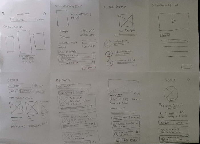
The next step is to make a sketch using the design sprint method, I made sketches using the Crazy’8. There are only 8 frames that portray the rough layout of the mobile app and this activity was carried out for 8 minutes using HVS paper as the media.

- User Flow
User flow is a comprehensive process or steps that users do to reach their goals/their objective when using this product. Here is the user flow for Tallent Sky App:

User flows have been done, it’s a crucial part before creating Lo-fi dan Hi-fi design, because I have to make sure that every scenario works well. There are 4 flows in the user flow created.
- Wireframe
After completing the user flow creation, the next step is to create a wireframe. Wireframe is a design of a user interface that is made using only gray scale colors. This wireframe will be the basis of making the User Interface.

D —Prototype
After finalize the ideate phase, I make a high-fidelity prototype by beautify the interface design, add some flows to make it interactive, and make the UI style guide to documented the design resources.
- UI Style Guide
Here is the UI Style Guide that I use on the high-fidelity interface of this Tallent Sky platform.

- Interface Design

For the interface design, I choose to put blue dominant color. I chose blue because blue can make us more optimistic and make us feel more comfortable and relaxed. In addition, the use of blue can also provoke learning intentions and can make us study calmly.
For the fonts, I choose Poppins and Roboto. Most of us are probably familiar with Poppins and Roboto. Apart from the good of this geometrical sans-serif typeface, using this font will give the users a sense of familiarity. Roboto itself creates a look that is more reminiscent of humanist and serif typefaces, giving it a unique function that is different from other fonts.
- Interactive Prototype
E — Testing
After completing the prototyping, the next step is to test the prototype that has been made. The things that are tested here are the idea of the problem, the flow in doing a task, the information provided when doing a task and what the user feels when completing a task. This testing phase is carried out using the In-Depth-Interview method to obtain a response from the user when using the prototype that has been made by providing a value. The testing stage is based on user criteria that have been determined.

After asking questions from the question list to the user. then the user will be given access to try the prototype and explore based on the user flow that has been made to find out whether the flow made is appropriate, comfortable and easy to use by the user. There are 4 tasks:
- user login and registration
- user opens Course Details
- user makes course purchase transaction
- users carry out the learning process until they get a certificate
when the user has completed all the given tasks, I will use the SEQ (Single Ease Question) to get a value in terms of the ease of the prototype that has been made. The Single Ease Question (SEQ) is a 7-point rating scale to assess how difficult users find a task, if point >= 5 then the design is considered to meet ease of use, while if point < 5 then the design is considered difficult by the user. based on the usability testing that I have done, the user gives 5 points with the following results:
- Key features Easy to use.
- How to use the app easy.
- Attractive and simple appearance.
- Users want quizzes that are varied, not just multiple choice.
- Users want to directly access the certificate after completing the peer assignment without having to go back to class details.
CONCLUSION
From the design that has been made, it can be concluded that the design that has been made is easy to use, in accordance with good user flow, simple and the appearance of the application is familiar so it does not need additional time to learn it. In addition, when viewed from the SEQ value given by the respondents, it shows that in terms of design, flow and information provided in the application, it meets the standards but needs some additional functions to support user needs.
Tallent Sky is expected to be the answer, maybe not only for learning platform, but also for other learning platforms in order to adapt the concept of a smart platform that can help users to get a guidance in their learning process, just like when they are learning in a non-digital platform.
What I’ve learned so far?
- Designing an interface is not only about its beauty but also its use and ease.
- Learned about making system designs starting from typography, colors, buttons, input fields, etc., which made it easier for me to design interface designs that are more than 10 frames.
- The need to practice my interviewing skills and find curiosity while still making the participants feel comfortable during the interview.
- Despite all the difficulties, I think that the learnings from the Tallent Sky design process would significantly influence the way we will approach similar projects in the future.
